eToken Redesign for BCR Touch 24 App
-
Client
Mobile App , UI/UX
-
Category
UI , User Experience
-
Tools
Adobe XD , MIRO , UI/UX
-
Start Date
08/08/2017
-
End Date
01/12/2017
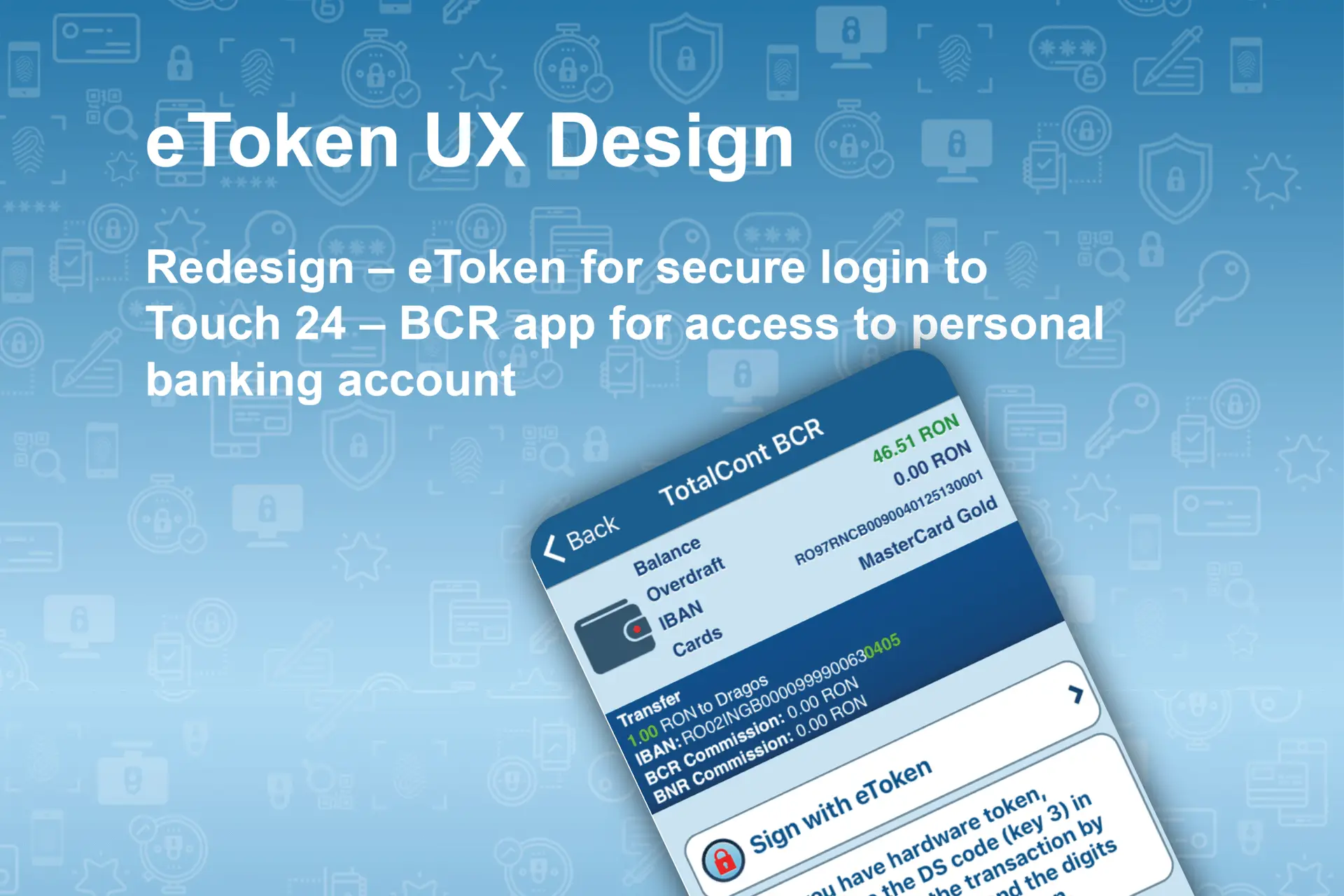
Case Study: eToken Redesign for BCR Touch 24 App
Project Overview
The eToken is a secure authentication tool integrated with the BCR Touch 24 banking app, enabling customers to access personal accounts and authorize transactions. This case study focuses on evaluating and redesigning the eToken Activation and Login Journeys, improving user understanding, reducing activation failures, and enhancing the overall user experience.
My Role
UX Designer
Responsibilities:
→ Conducted user flow analysis and identified pain points.
→ Redesigned key activation and login screens.
→ Defined and improved micro-interactions for better user guidance.
→ Created UI improvements aligned with BCR’s George Design System.
Current Challenges ("As-Is" Analysis)
Complex Activation Process: Multiple steps requiring details from physical documents, leading to user confusion.
Unclear PIN Setup: Users misunderstood the purpose of the PIN, seeing it as another password rather than a simple numeric code for quick access.
Biometric Activation Hidden: Optional biometric authentication was not clearly promoted after activation.
Limited Error Feedback: Users encountered failures without clear instructions on how to recover or correct mistakes.
Missing Back Navigation: Some critical screens like PIN and Finger Scan lacked easy navigation back to previous steps.
Goals of the Redesign
- Simplify activation and login flows.
- Clarify terminology (e.g., clearly explain "PIN" vs. "Password").
- Provide clear, in-context help and recovery options.
- Integrate biometric options more prominently.
- Enhance visual feedback through progress indicators and status confirmations.
Key Design Improvements
Activation Process Simplification
• Combined Welcome and Activation screens with intuitive call-to-action buttons.
• Clear visual guide for required activation data with an "info" icon tooltip.
• Step-by-step progress indicator during activation.
PIN Setup Redesign
• Introduced an explainer tooltip for the word “PIN,” clarifying its purpose.
• Added a visual strength indicator bar and bullet-pointed requirements, using green/red visual cues for user feedback.
•
Provided an inline info section about where and how the PIN will be used.
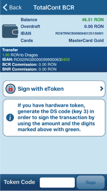
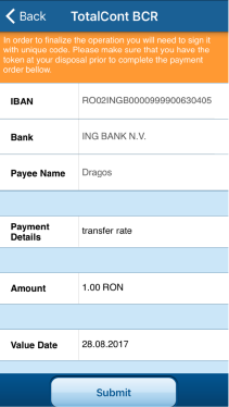
Transaction Signature Journey
• Simplified steps for validating and submitting transactions from Touch 24.
• Integrated QR code scanning directly from the eToken app for faster verification.
•
Enhanced confirmation screens to reduce user uncertainty after submission.
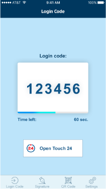
Login Experience
• Consolidated PIN, Fingerprint, and OTP options into a more cohesive interface.
• Introduced back navigation on all authentication screens.
•
Improved the OTP countdown animation for clearer timing visibility.
Biometric Authentication Enhancement
• Offered biometric setup immediately after successful activation with a clear SKIP option.
• Added benefits explanation to encourage biometric use.
Outcomes
- Reduced activation failures by providing clear guidance and simplified steps.
- Increased biometric protection adoption by 30% due to improved placement and promotion.
- Decreased customer support calls related to eToken activation by 25%.
- Enhanced user satisfaction with faster and more intuitive login and transaction processes.
Conclusion
The eToken redesign project successfully transformed a fragmented and confusing authentication experience into a streamlined, user-friendly journey. By focusing on simplifying critical processes like activation and login, clarifying terminology, and promoting secure authentication methods, we significantly improved the overall customer experience.
This case study highlights how thoughtful UX design, paired with a deep understanding of user behavior and clear communication, can directly impact adoption rates, reduce support costs, and increase user satisfaction in critical financial applications.